Data Visualization Training Seminar
Employer: NTT Data (2022)
Overview
The world is increasingly data-driven. There is so much data that visualization becomes necessary for understanding and solving problems. Our clients are increasingly looking for data-powered solutions, and our job is to create solutions that make complex datasets more understandable and actionable. Due to this shift, I was tasked with creating an interactive training seminar that would teach our UX department about the importance of, and how best to utilize, data visualizations.

Research & Planning
Though I had previous experience in Python or apps like Tableau, I was relatively unaware of the core fundamentals of data visualization. I did a deep dive into literature about data viz, and I even looked back at some college class notes that covered the topic. I had to make sure I was an expert myself before teaching a potentially complex topic to others.
Finally, I knew to make this seminar as engaging as possible. I attended enough presentations where I was already falling asleep after 10 minutes. To avoid “death by Powerpoint”, I planned an activity to do with the audience at the end of each topic section. Each activity would be a fun way to stay engaged, but it would double as a way the audience to check their understanding of the topics we had just covered.
What is Data Visualization?
This presentation was to be geared toward total beginners when it came data visualization. As a result, I knew I had to begin from a familiar place. I started by emphasizing the fact that everyone already uses data visualization every day, but you just might not recognize it. I then moved into the reasons why this topic was important for us to learn and also the major considerations for designing a visualization.
Topics covered in this section:
Data viz definition + examples
Why are we learning about data viz?
Who is your audience?
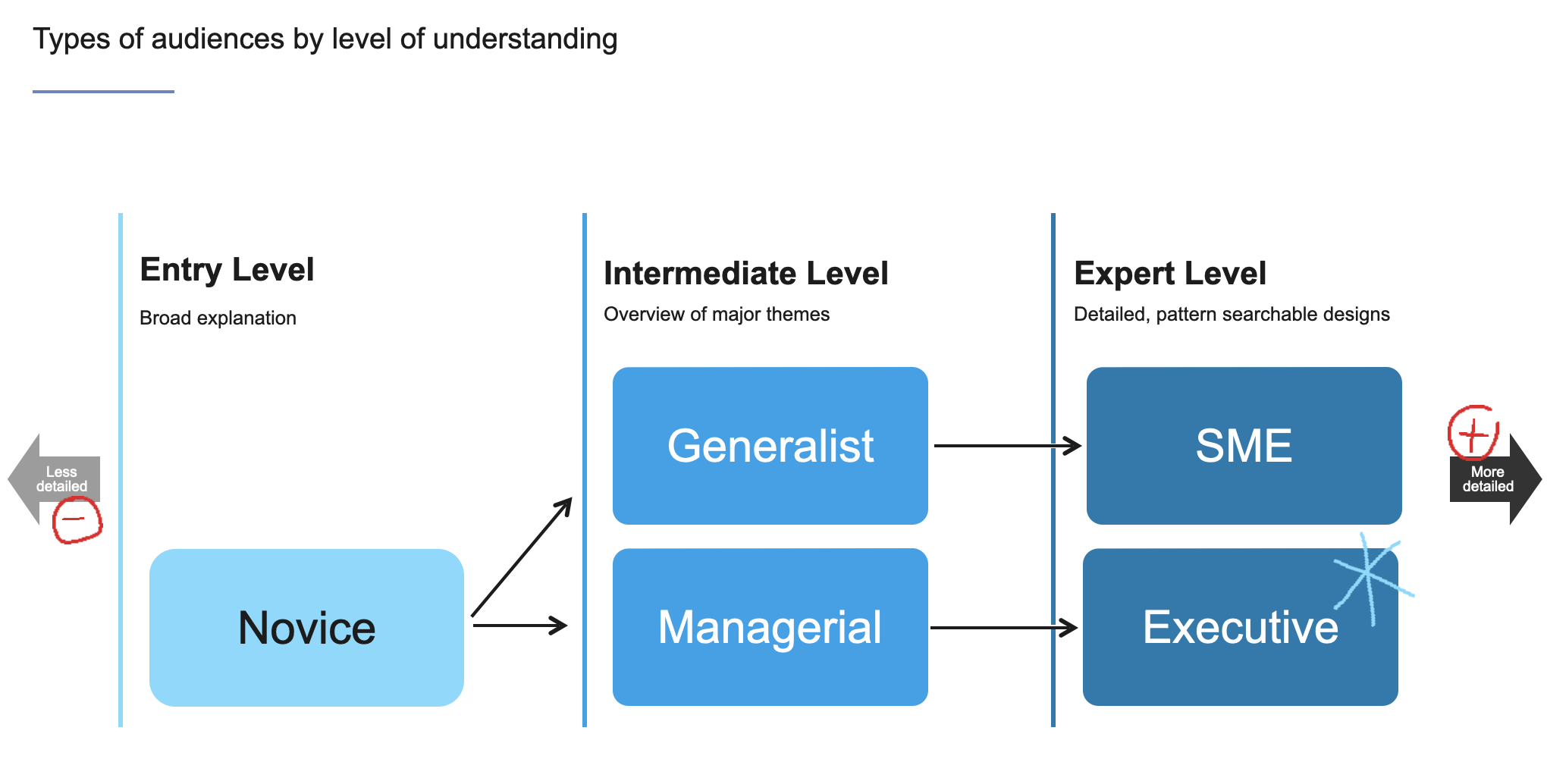
who is your audience?
everday data viz
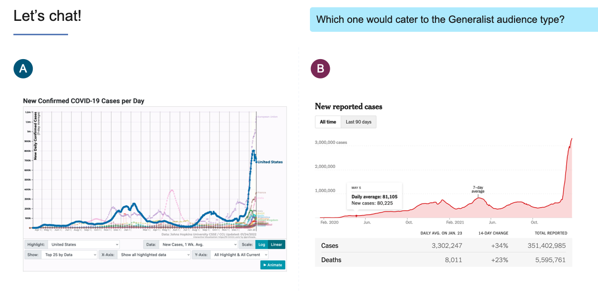
example of data vizActivity: Selecting the right audience
I displayed two data visualizations on the screen that varied in complexity but were displaying the same type of data. I then asked the audience to vote for which one they thought would be best fit for a “generalist” audience.
Designing a Data Visualization
In this section, we taught how to make a data visualization from the ground up. We covered the process of selecting the narrative you want to convey with your data, the different ways to visualize it, and how to properly style visualizations
Topics covered in this section:
What is your narrative?
How do you organize your data?
Which visualization should you choose?
Coloring data visualizations

what is your narrative?
important data concepts
types of data vizActivity: What’s wrong with this data viz?
I showed the audience a few data visualizations with errors and asked them what they thought was wrong with them. The errors were comical and not difficult to spot, but the goal was to get them thinking about how a poorly designed data visualization can be harmful.


Building a Dashboard
My supervisors for this project requested my seminar put a big emphasis on data visualization dashboards. They felt that dashboards are a growing need for our clients, and it’s important that employees learn the fundamentals of how to make one. In this final section, I pull together all the knowledge from the previous sections to explain how to make an effective data viz dashboard.
Topics covered in this section:
Building a dashboard
Types of dashboards
Types of interactions
A dashboard case study

example of a dashboard type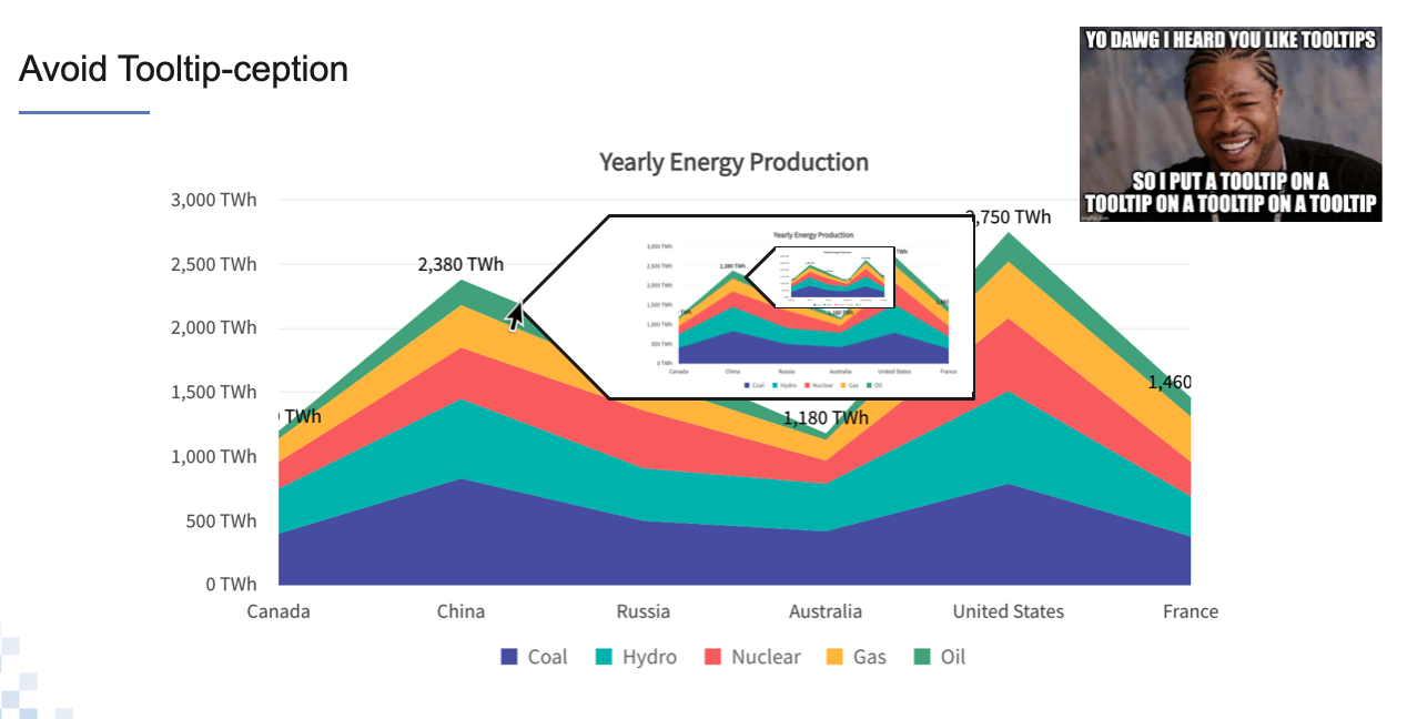
advice about tooltip interactions
data viz case studyActivity: Choosing the right dashboard
This was a two-part activity in which I created a hypothetical scenario where the audience was tasked with making a dashboard for a client.

